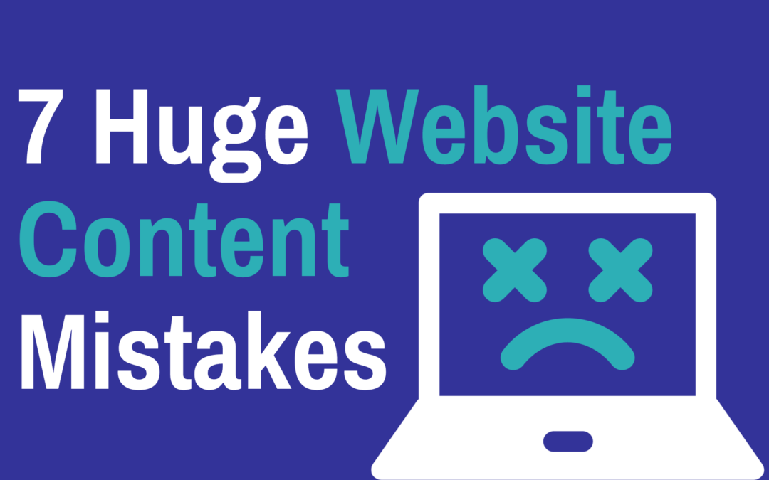
When it comes to your website, looks matter. But not nearly as much as well-written and clearly presented content.
Too many companies spend big money on flash websites only to overlook the messaging itself.
And it’s causing them problems.
All design and no substance simply doesn’t sell!
Your website needs to let potential customers know exactly how you can solve their problems and why they should keep coming back.
Does your website make any of these huge content mistakes? Read on to find out…
1: Me, Me, Me…
Many websites indulge in parading what they stand for right from the off. Readers are bombarded with vague, rambling monologues that don’t offer them any real connection.
Repeat after me. The customer must come first.
Your website needs to be all about them – the reader.
Not about you, your business or your products. That will play a part, of course, but a very small one!
Your content needs to explain to newbies that you understand their problems, pains and frustrations. You need to show them clearly and concisely that you realy “get it” and that you have a solution that will deliver them their dream results.
To put it simply, people only care about themselves. If you’re not talking about them and their problems and their dreams then they won’t be interested in what you have to say…
Professional writers find it easy to keep their content “reader-focused”, but if you’re not a copywriter then using the 3:1 ratio rule is a good way to make sure you’re on track.
For every ‘I’ or ‘We’, there MUST be three ‘You’ or ‘Yours’. How does your website score?
2: Crap Headlines
‘Welcome to <insert company name here>’ emblazoned across your homepage is an almighty BORING way to greet your reader.
I mean, come on. This is your opening headline?
Hardly makes an impression, does it? I wouldn’t buy that newspaper!
Page headlines throughout your website are the most important thing. As the father of advertising, David Ogilvy, once said “On average, five times as many people read the headlines than the body content.”
In fact, your headline only needs to do one thing: catch your reader’s attention and make them want to read on.
Here are two short and snappy homepage examples to inspire your own writing.
“Make your website better. Instantly.” (Crazy Egg)
“Everything you need for work, all in one place” (Dropbox Business)
3: Not Empathising
Business relationships are no different – customers need their feelings heard too.
Showing the reader you can solve their problems is absolutely vital, but what will REALLY bring them on board is communicating that you understand how it feels in the first place.
It’s the soft skills side of sales. Demonstrating empathy builds trust and moves prospects further through the buying journey.
If potential customers don’t feel understood by you, they won’t give you their money.
4: Clutter
Crowded, visually unappealing website content is usually the product of businesses not bothering to bring in writers during the site-building process.
Neither web developers, nor the clients they work for, are content or copywriters.
So, naturally, when the client is asked for the website copy, the whole project is put on hold whilst they work out what to say. Word soup eventually pours from the tips of their fingers and long, waffly webpages are born.
These badly written webpages inevitably feature drawn-out sentences and huge chunks of text which are hard for the reader to follow. And if it isn’t easy, it isn’t happening!
Improved aesthetics and clever formatting helps to convey your messaging clearly. Read on for a beautifully positioned next point.
5: No Dual Readership Path
Readers consume content in different ways.
Skimmers are impatient and want the facts, fast. Detail-orientated readers, however, will chew through every sentence of a page.
Throughout your entire website, you need to satisfy both approaches.
Declutter your text-heavy areas. Use smart headings and subheadings to organise your information. Keep all messaging clear and to the point, and format keywords and phrases in bold or italics to enable skimmers to pick at the highlights.
6: Focusing on Features Not Benefits
Most content is feature-heavy. It describes what the business has and not how they can help. It’s business-focused, and not customer-focused.
Benefits, however, tap into the feelings of the potential customer. Let me give you an example.
As well as writing great content for businesses, my husband and I used to run a successful wedding DJ hire business.
Listing the full technical capabilities of our kit, including how many decibels the speakers accommodate and the LED count of the mood lighting, was not going to bag us many leads.
How many brides have you known to compare audio equipment when planning their big day?
Those are the features. Impersonal. Unimportant.
They’re not interested in the specifics of the speakers, they’re interested in what they can do for them.
What your average bride wants is a full dance floor and an awesome party atmosphere. It’s that messaging – describing the benefits to the customer – that enabled us to sell our services effectively.
7: No Clear Call To Action
How you position your calls to action, or CTAs, determines whether a lead converts.
Your website needs to hold your customer’s hand and lead them through every click. At no point should you hear a tiny ‘okay… now what?’
Word the copy on your buttons to highlight the benefits to the reader. Whatever the action you want your reader to take, it needs to be crystal clear.
And be gentle. Asking for too much too early will scare off any prospects.
So, how did you do?
Any glaring changes you need to make?
It’s a lot to think about, I know. It’s a big arena. But you can get there.
And if you’re overwhelmed by the scale of it or need help finessing your word soup, book a call with me.

Free Website Content Checklist.
Not getting the results you want from your website? It could be that your content is the problem.
Click the button below and we’ll send you our website content checklist so you can see how your copy measures up!
Read More Like This…
How to Write Emails That Sell More Stuff
What are you doing to sell your services or products? You have a shiny, modern website, right? It has an up-to-date shop with a great user experience? And you have regular blogs going up that are engaging and filled with SEO? That’s great. What about emails? I saw you...
How Much Should You Expect To Pay For Email Marketing?
Everyone likes a low-cost, high-return purchase. And that’s why marketing consultants are quick to sell you on the multitude of benefits of email marketing! It’s short, requires very little technical knowledge to get set up and can improve your customer retention like...
Inbound Marketing Vs Outbound Marketing – The Pros & Cons Of Both
Let’s be honest - the ‘Skip Ad’ button is one of the best things since sliced bread. Over time, marketers have learned that people don’t always like to be interrupted. Sometimes, you just want to watch your damn video! That’s how the ‘inbound marketing vs outbound...
